16

This question links to a Russian version of Peel from Reality which has “Мгновенное заклинание” as its type line—literally, “Instant spell” rather than just “Instant” (I assume there is some Russian grammatical reason why just “Мгновенное” would be unacceptable).

“Мгновенное заклинание” takes up far more horizontal space than “Instant,” which got me thinking—what does Wizards do when the translation of a type line takes up more room than the available space? I know some Magic cards have substantially longer English type lines than “Instant,” and several fill up very-nearly the entire available space (e.g. Theros’s “Legendary Enchantment Creature — God,” though I see the Russian version of that is “Легендарные Чары Существо — Бог” and fits in the available space—though it’s getting even closer to the limit there).

So, does Wizards of the Coast limit type lines based on translations? Or do they accept that some translations aren’t going to fit—and if so, what do they do then? Clearly, “Мгновенное заклинание” suggests that they haven’t found as-short-or-shorter translations for everything, so this is a possible concern (not that I expect them to print a “Tribal Instant — Arcane” or anything like it any time soon, which seems like the only way “Мгновенное заклинание” itself could run into trouble). Do we have any examples where it was a real concern?

2
  • I recall Maro noting that the original Theros God's weapons weren't "Legendary Artifact Enchantment - Equipment" for non-english type line length reasons
    – Caleth
    Commented Mar 9, 2020 at 15:48
  • @Caleth I remember reading about those too, but I didn’t remember that the issue was specifically non-English. My recollection was that it was a problem in English, too, but I may have just forgotten the non-English part. If you can find that post and confirm the non-English aspect, that might well be a good answer to this question.
    – KRyan
    Commented Mar 9, 2020 at 15:52

5 Answers 5

24

Generally—they just make the font size in the type line really tiny.

Some good examples are the Titans from Theros Beyond Death, which are Legendary Creature — Elder Giant. I've included other Giants in that search result so you can see that they just shrank down the font size a lot on Kroxa and Uro. They did the same for Thryx, the blue legendary card in those results, who is an Elemental Giant.

Here's three white cards in Russian side by side so you can see how much the font size might vary:

enter image description here

(Also the vertical alignment varies too apparently, probably for lack of attention/care rather than for any good reason. Oof.)

That's not limited to Russian, either. Here's some German cards undergoing the same treatment, where the middle one doesn't need any font size adjustment:

enter image description here

3
  • That search is an excellent example, really stark in the case of Kroxa and Uro.
    – KRyan
    Commented Mar 9, 2020 at 15:57
  • A time-tested solution :) in the early Magic sets, some of the normal English cards already had tiny font to accommodate for the wall of text that was required.
    – xLeitix
    Commented Mar 10, 2020 at 16:22
  • 1
    See Oubliette: scryfall.com/card/arn/31/oubliette
    – xLeitix
    Commented Mar 10, 2020 at 16:23
19

Adding onto the previous two answers, scaled down fonts are not exclusive to non-English card prints.

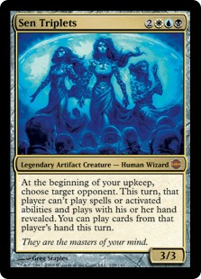
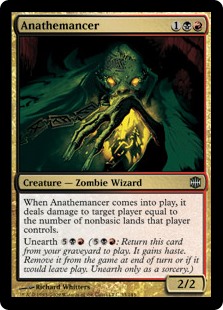
As a specific example, the card Sen Triplets is a "Legendary Artifact Creature - Human Wizard". The text line is scaled down in order to fit in the text box. I've added another card from the same set as a comparison.

enter image description here enter image description here

Sen Triplets is probably the easiest one to see. AFAIK it's the only card in the game with the "Legendary" supertype, two types, and two sub-types. However, there are undoubtedly other cases where the text has been scaled down.


(EDIT: Shortly before the release of Modern Horizons 2 on June 18th, 2021, a large number of cards were retroactively updated to include the subtype "Phyrexian". One of these cards includes Brudiclad, Telchor Engineer, who now has the type line of "Legendary Artifact Creature — Phyrexian Artificer". This type line is somewhat longer than the type line on Sen Triplets. However, the updated type line has yet to be printed on any cardboard copies of Brudiclad. If we see a new print run of Brudiclad, I will update this answer accordingly.)


To further illustrate the point, here is the type line for Sen Triplets and Sharuum the Hegemon, a creature that came out in the same block and is also a "Legendary Artifact Creature", but has the much shorter sub-type Sphinx and not "Human Wizard".

enter image description here

enter image description here

It seems to be very common with permanents that have the "Legendary X Y" template while also having a sub-type. The 5 color cycle of "Legendary Enchantment Artifact" from the original Theros don't seem to have scaled down text because of their lack of sub-type, but "Legendary Artifact Creature" and "Legendary Enchantment Creature" seem to be full of them.

List of Legendary Enchantment Creatures - The Demigod Cycle from Theros Beyond Death in particular seem to have noticeably scaled down type lines, although not as noticeable as Sen Triplets.

List of Legendary Artifact Creatures - Sen Triplets can be found here, and is the only entry in either list with two printed subtypes (see earlier note on Brudiclad). However, all of these cards seem to have type lines that have been somewhat scaled down.


It's probably a safe bet that, if the type line stretches all the way across the card to the set symbol, it's probably been scaled down a bit.

3

WotC aren’t above truncating words to make translations fit. The Throne of Eldraine instant-speed Adventures are spelled “Мгновенное — Приключение” in Russian (which still requires a smaller font). This is actually acceptable grammar, as substantivized adjectives are common in Russian, as opposed to word-for-word translations like “Enchantment Creature — Human Cleric” → “Чары Существо — Человек Священник” which are extremely clumsy because Russian just doesn’t work that way (noun sequences such as “noun sequence” aren’t a thing in Russian).

1
  • A translation of that last, “extremely clumsy” phrase would help those of us with no Russian get the point. +1 anyway though, since the core of the answer is still strong.
    – KRyan
    Commented Mar 11, 2020 at 12:54
2

Magic has absolutely run into this issue before, Russian is probably the most common language for it, but English is not immune - I have never seen it in Chinese, Japanese or Korean, due to the way much fewer, but more different characters are in those languages to represent the same ideas.

When this happens the system does a few things to make the text fit, the solution Magic has always used is to change the font size and reduce kerning - making the characters smaller and closer together so they fit.

Most often this is a problem on creatures, as spells rarely have many types, but it has happened with spells, such as Nameless Inversion, as a Tribal Instant - Shapeshifter. In Russian that spell's type is Племенное Мгновенное заклинание — Имитатор too large for the text box so the font size is slightly smaller.

This doesn't only happen on the type either - there are many examples of cards where they have needed to shrink the contents of the text box, even without flavor or reminder text, though these are fewer and farther between then they were in the early days of magic. One of the worst examples of this is Dance of the Dead.

0

They scale down the font
see Russian Reaper King for Example However, if you look toward unsets, you can find cards with multi-line namebox or other modification

4
  • 1
    Hm, neither of those latter links includes an actual image for me, they just show the Magic card back instead. Maybe a region thing? (Amusingly, the Gatherer website itself seems to do some text scaling on the card title—“Nos études de marché révèlent que les joueurs aiment les noms de carte vraiment très longs alors on a fait en sorte d'obtenir l'élémental avec le nom de carte le plus long possible” it at an unreadably-tiny font size in that last link.)
    – KRyan
    Commented Mar 9, 2020 at 16:02
  • (Of course, both of those cases were intentional jokes and have the same modifications in English, so they probably don’t really answer this question.)
    – KRyan
    Commented Mar 9, 2020 at 16:04
  • The elemental clearly is a joke but I think that the Infernal spawn of infernal spawn of evil might be a legit experimentation.
    – mreux
    Commented Mar 9, 2020 at 16:14
  • 2
    Infernal spawn or infernal spawn was from Unhinged, a silver-border set where almost every single card got its own custom frame treatment tailored exactly to the joke on the card. Current silver-border cards don't do that. It might have been an experimentat, but it's not an internationalisation thing. Commented Mar 9, 2020 at 16:33

You must log in to answer this question.

Not the answer you're looking for? Browse other questions tagged .